CONCEPT
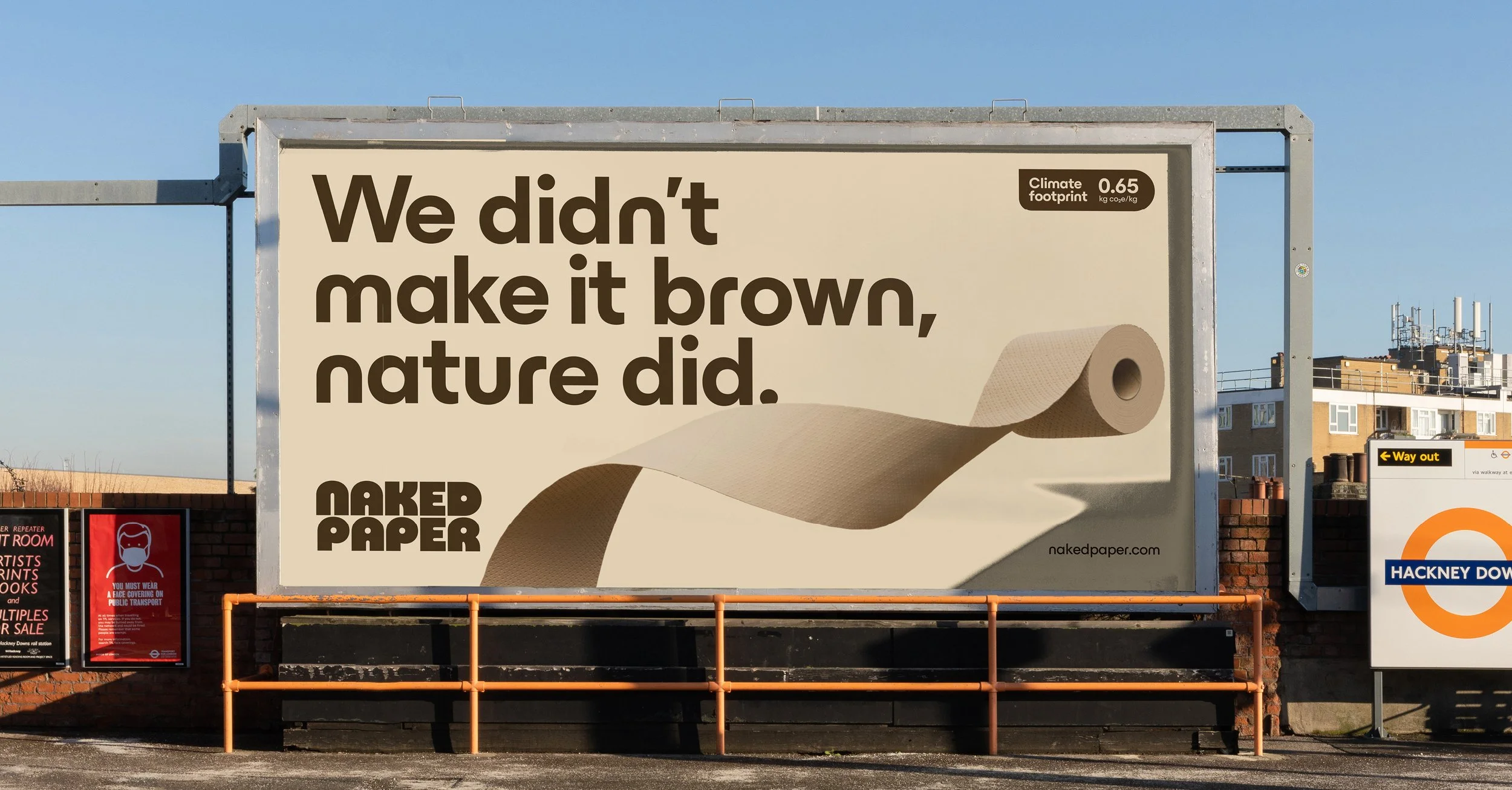
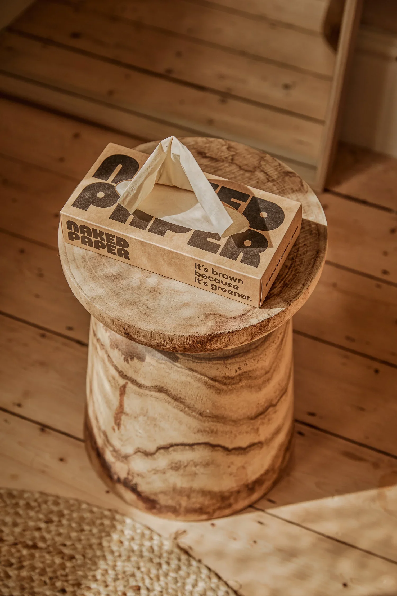
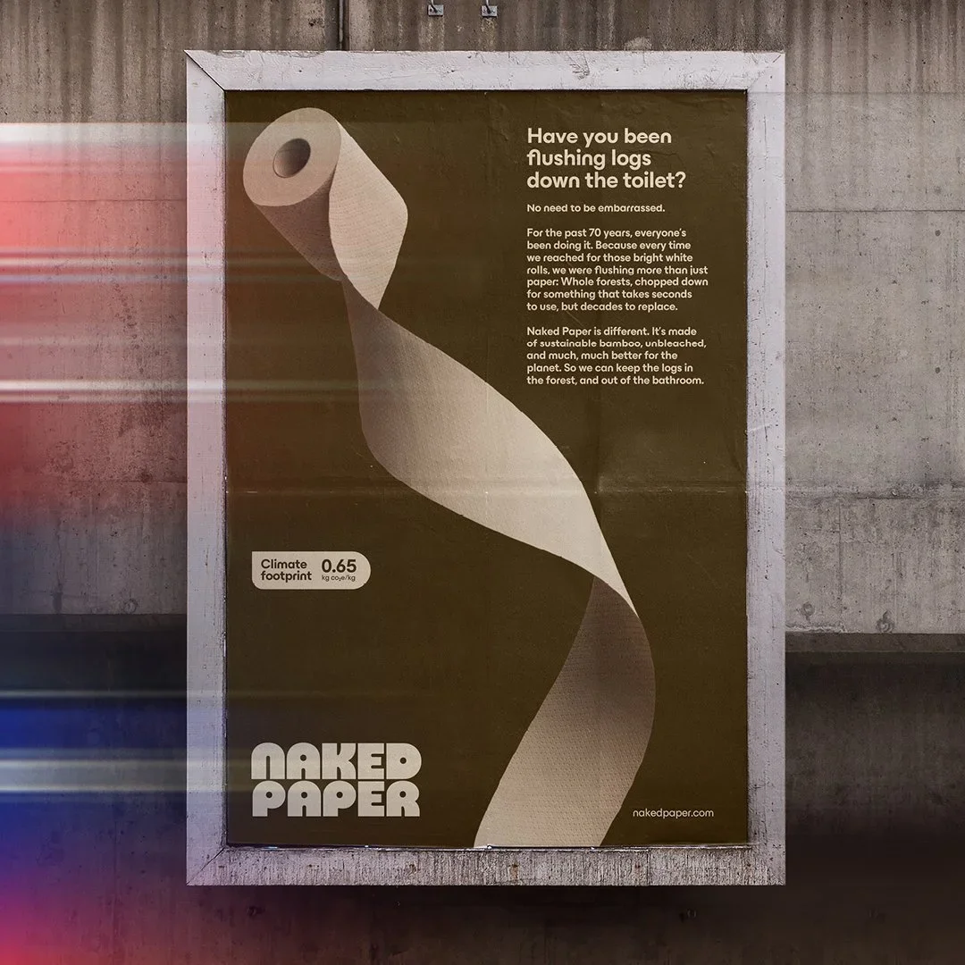
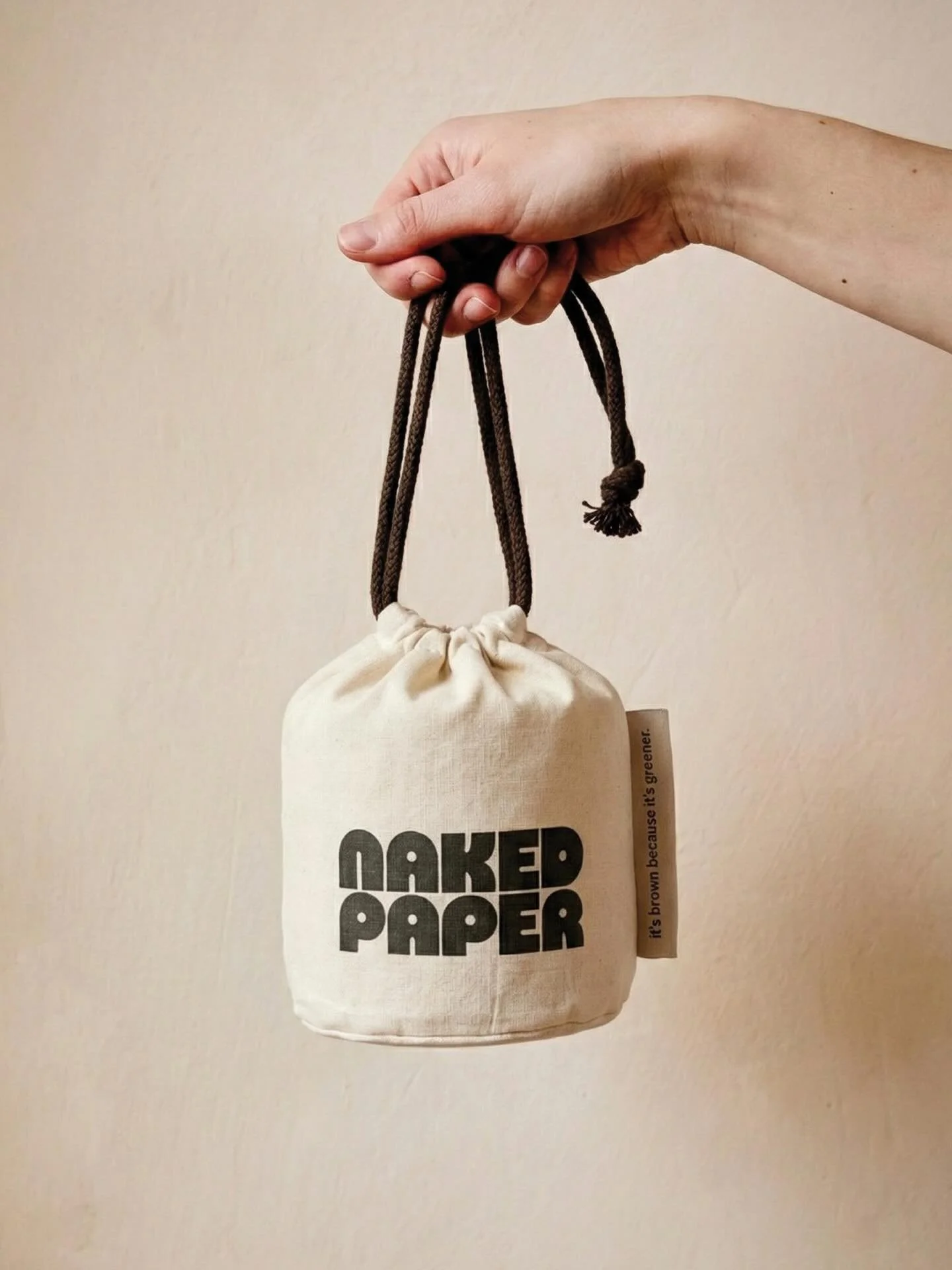
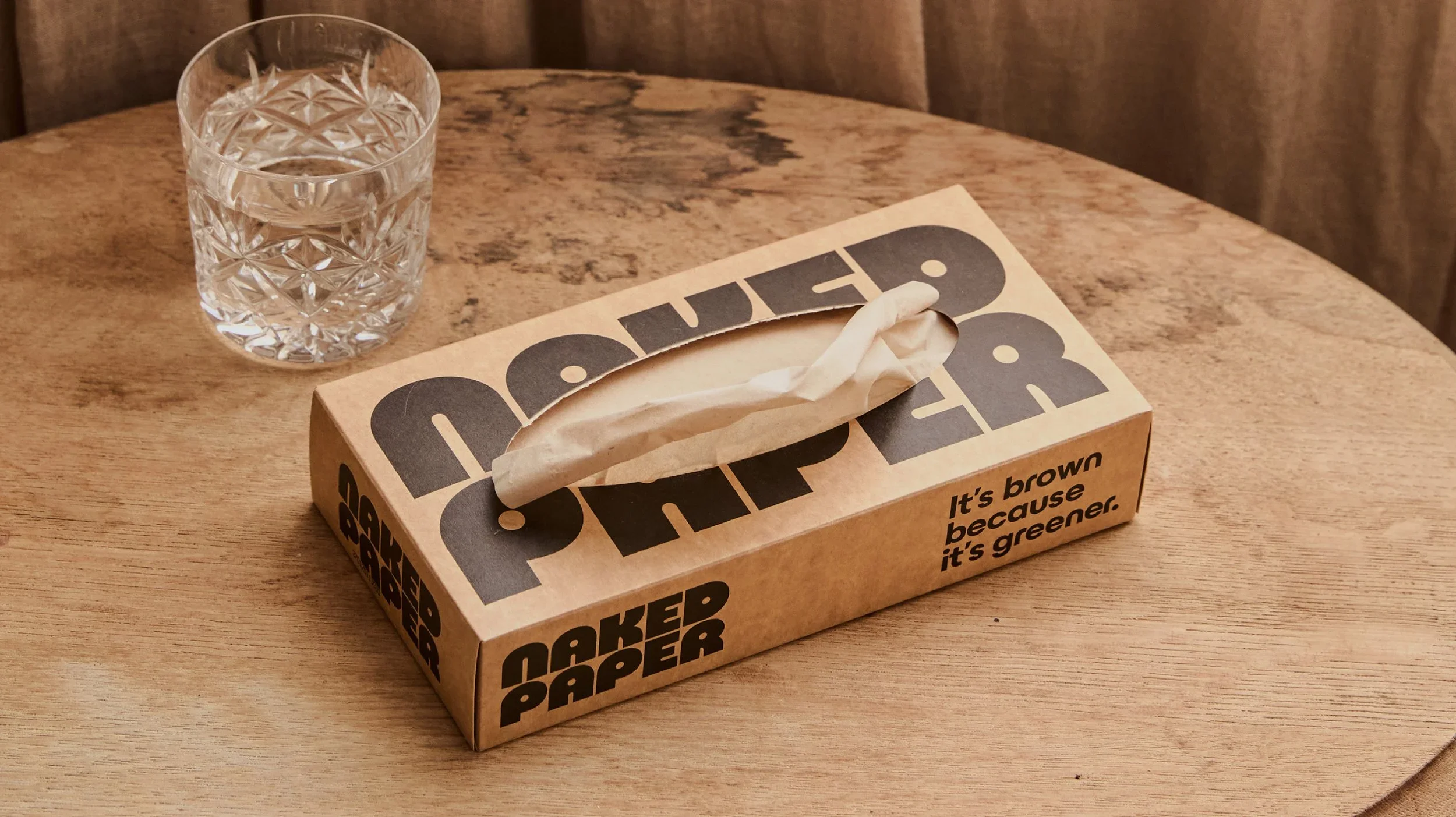
Built around the idea it's brown because it's greener, the identity embraces reduction at every level.
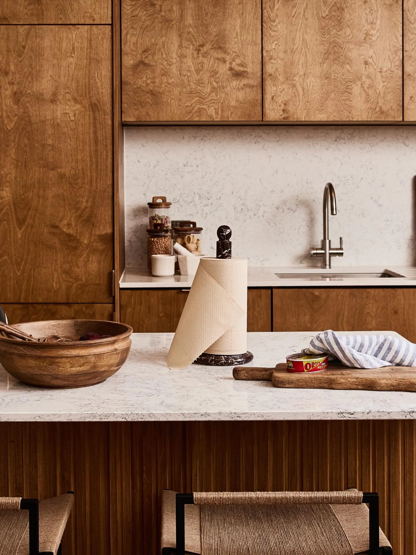
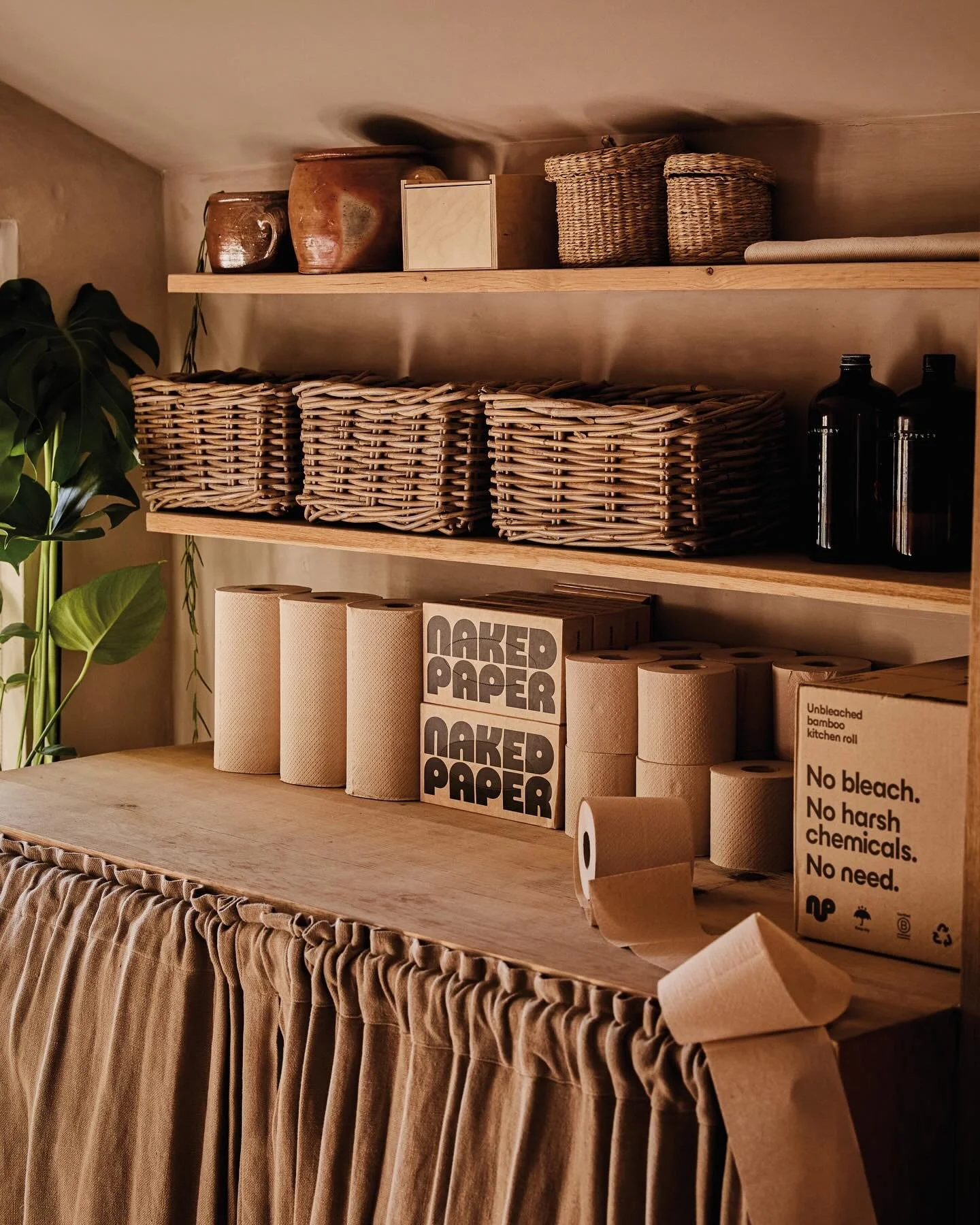
A stripped-back design system lets the material speak for itself, with brown becoming the defining brand colour and every element earning its place.
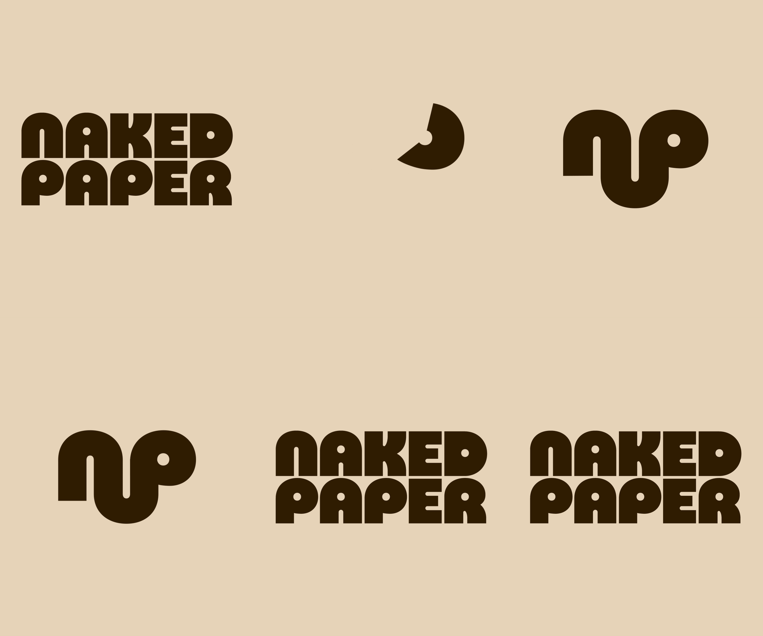
A hardworking 3D paper asset forms the foundation of the visual language, cropped and reimagined across applications, while the logo takes inspiration from the simple geometry of a toilet roll. Warm, natural art direction featuring wood, paper and organic textures reinforces the brand's honest, sustainable point of view.



AWARDS
2026 - Dieline Award for Best Rebrand and First Place in Visual Brand Identity Systems
2026 - Creative Circle, Branding Refresh - Bronze