
The Brief
To refresh BRAVE’s logo and to design their new cereal packaging.
The Concept
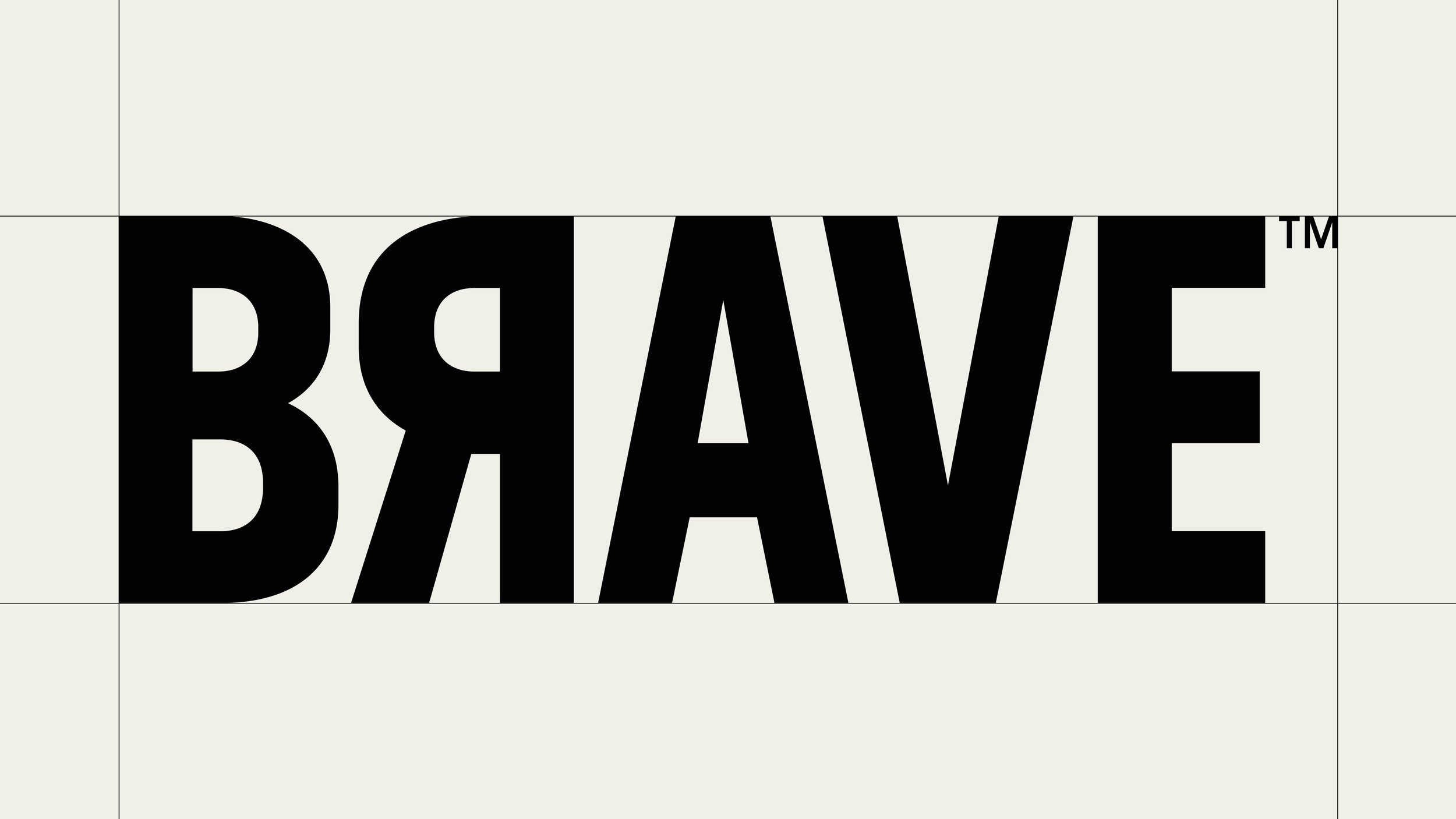
By removing the illustration, drop shadow and wobbled lines from the original logo, it immediately moved the BRAVE logo into a more contemporary space. Flipping the ‘R’ felt BRAVE and filled the space between the ‘B’ and ‘A’ nicely, which created a tightly tracked and well-balanced logo.
The packaging design aims to strike a balance between fun and functional. It’s inspired by both children’s cereals and sports design, the fusion of black type, white backgrounds and brightly coloured illustration shapes.
- Logo Design, Packaging Design and Illustration.
My Role — Designer
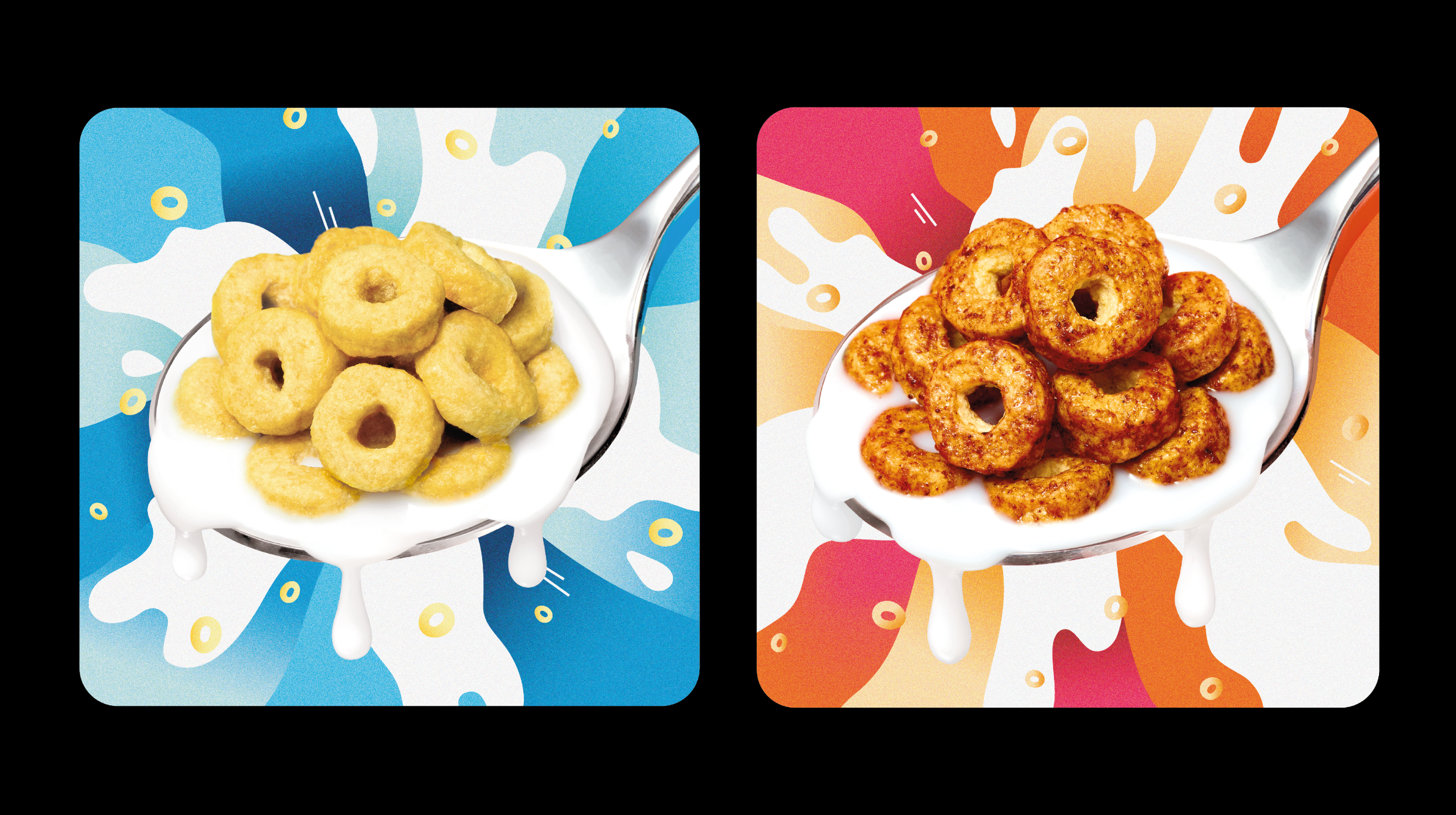

Concept packaging design for BRAVE, artworked by their internal team


Agency — Otherway