
This identity went live across multiple media channels. It has now been re-skinned into a completely new brand which is more commercial and at a lower price point, it therefore does not exist as the original look and feel below.
The Brief
To design the identity of a new vegan skincare collection which puts the process of fermentation at its heart.
My Role — Lead Art Director and Designer

Logo by Kerry Roper
The Concept
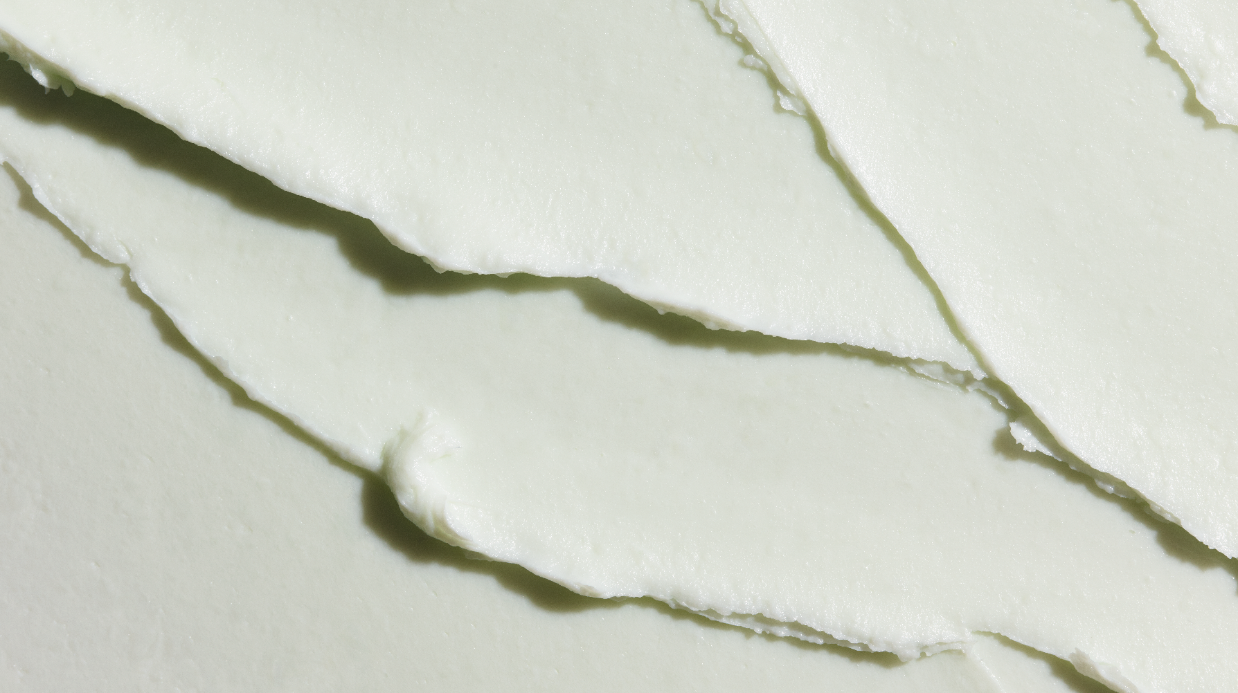
As fermentation was the key process for the products, the photography art direction looked at each asset through a macro lens. We created abstract paintings to represent the product fermentation process and combined them with macro beauty shots. Our photography has zero retouching for authenticity, celebrating real life natural beauty. The suite of assets were combined in a modular grid system and the visuals were selected based on the colour palette and connecting lines.


In each of the products they have taken natural, plant-based ingredients and fermented them. We created textured paintings to represent the process and wrapped each product with its own unique artwork.


All beauty photography is un-retouched, ensuring that we show real un-filtered skin.
GIFs may take a moment to load


